top of page


intro
MASTER IN ART-DIRECTION // FLOWERS BY BORNAY
BAMBI MORTUARY is an aesthetic strategy to open a conversation about the journey of grief. Here you’ll find the documentation of the process, from the conception of the concept to the production of a floral installation and its photographs.
A special acknowledgment to the book that inspired our creative process, The year of magical thinking, by the marvelous and pragmatic Joan Didion.
Content
BAMBI MORTUARY
1. BRIEF
3. FINAL PIECE
— 3.1. Final images
— 3.2. Who is it for?
— 1.1 Concepts & Roses
2. 4D
— 2.1. Discover
— 2.2. Define
— 2.3. Develop
— 2.4. Direct
4. TEAM
— 4.1 Contact us
BRIEF
Disruption & Creation Brief
This project took place within the framework of Elisava’s Art Direction and New Narratives Master, which fosters an environment of multidisciplinary and multicultural creators, as well as an organized design methodology.
brief
Concepts & Roses: develop a unique concept and express it in the floral language.
Overall theme direction:
Illusions, exploring how our mind sees the unreal.
Special Collaboration/ guidance:
FlowersbyBornay, floral art studio based in Barcelona.
Requirements:
Applying the 4D creative model: discover, define, develop and direct.
The four D's
DISCOVER, visual flaneurs
Visual imaginarium: surrendering to the irrational, following our hunches
In order to escape common ideas, this process began with us thinking with our hands; we allowed our unconscious minds to come out and play. We let our eyes wander through Barcelona, libraries, and social media, looking for anything that would spark our curiosity.
Images were everywhere we looked, and the connection to a particular image was the only filter we applied for it to be included in our research. We ended up finding inspiration everywhere: the Barcelona Design Hub library, Instagram, the MACBA museum, the streets of Barcelona, our memories, Spotify, iPhone camera, digital portable camera, our houses, each other, Mubi, books, magazines, and YouTube. Connections with images are hard to explain, they are conditioned by unconscious reasons.
The only constraint we set for ourselves was avoiding the use of Pinterest, refraining from actively looking for images, allowing the images to come to us, and resisting the inherent urge to control.

We started off with a selection of 222 images that ranged from antique ceramics (1) , to love poems (2) and saturated images on Tel Aviv’s (3) beach, to Bugs Bunny (4) and Rob Mulholland’s (5) Vestige installation, to Hiroshi Sugimoto’s (6) photography. These images were then printed and placed on a large table where the different styles, colors, materials, and shapes contrasted with each other, and inexplicably, somehow, told a story.
After seeing our 222 images laid out, we were ready to start creating, and suddenly, yet another disruptive instruction was given to us:
we had the possibility to add images to our board by stealing them from other teams who had done the same process, and they could do the same with ours. Panic came over us; our controlling side did not want to share. We were attached to our images; we had chosen them; they were ours. Despite our dissatisfaction, the swapping began. Later, we began to play with the images we were left with.
Illusion collage:
manipulate to comprehend
The process involved decision-making for image selection, sizes, composition, image alteration, and an overall definition of a narrative. We used our hands but also put our reasoning back into the game, to name what these images were communicating through different visual codes. (7)
As a tool, collage allowed us to mix seemingly unrelated images and further explore the definition of the term illusion. It compelled us to properly name images, to set aside 'taste', and to pragmatically observe these visual compositions.
[7] collages
Translating images into words:
connecting elements that were not connected before
We - predictably - asked chat GPT to give us a general definition of the term illusion as perceived in psychology. How accurate is it? hard to tell, but we are not writing a paper on psychology, so the general online definition is alright for us.
“In psychology, an illusion refers to a perception or interpretation of a sensory stimulus that does not correspond to the actual physical properties of the stimulus. [...] They often involve misinterpretations or distortions of sensory information, leading individuals to perceive things differently from how they actually are.
In the context of psychology, illusions are often studied to understand the mechanisms underlying perception and cognition. Researchers aim to uncover how the brain processes sensory information and how cognitive factors can influence the way individuals perceive and interpret the world around them. [...]”

That led us to think about the importance of perception when talking about illusions, which immediately reminded us of a specific passage in the book The doors of perception, by Aldous Huxley.
“We live together, we act on, and react to, one another; but always and in all circumstances we are by ourselves. The martyrs go hand in hand into the arena; they are crucified alone. Embraced, the lovers desperately try to fuse their insulated ecstasies into a single self-transcendence; in vain. By its very nature every embodied spirit is doomed to suffer and enjoy in solitude. Sensations, feelings, insights, fancies—all these are private and, except through symbols and at second hand, incommunicable. We can pool information about experiences, but never the experiences themselves. From family to nation, every human group is a society of island universes.
Most island universes are sufficiently like one another to permit of inferential understanding or even of mutual empathy or “feeling into.” [..] But in certain cases communication between universes is incomplete or even nonexistent. The mind is its own place, and the places inhabited by the insane and the exceptionally gifted are so different from the places where ordinary men and women live,
that there is little or no common ground of memory to serve as a basis for understanding or fellow feeling. Words are uttered, but fail to enlighten. The things and events to which the symbols refer belong to mutually exclusive realms of experience.
To see ourselves as others see us is a most salutary gift. Hardly less important is the capacity to see others as they see themselves."
*Editor's note: for narrative purposes we will focus on the process of defining the concept related to the illusion of grieving, since it is the one that we chose to further develop. But, all of the three collages that we had underwent the same process.
DEFINE, connecting the dots
Creative Concept
The illusion that's created by grief is connected to ‘magical thinking’, as Joan Didion explains in her book The Year of Magical Thinking (2003). It is a switch in perception triggered by the loss of a loved person, which makes you revert to a similar thinking structure as the one you had as a child: unreasonable ideas suddenly carry significant weight. You start to think that your mind has the power to change facts, that your loved one will come back walking through the door, you might blame yourself for not foreseeing the death. It alters the way you perceive the world, as if your mind has not caught up with reality.
Then we selected some keywords that could describe our collage, which had emotionally led us to connect with grief. Keywords: personal loss / pain / death / paralyzed / mourn / cemetery / void / separation / loneliness / silence / spells / fantasy. These keywords were the starting point on an exercise of seeking for a creative concept - a verbal expression that defines, synthesizes and guides a message. We decided on Bambi Mortuary: a place to face the reality of death through the veil of magical thinking.

We chose the word 'Bambi' as a universal symbol of grief, pain, innocence, and childhood, in a dark fantasy sort of way. Also, as Bambi’s original writer said, “I want to show that the world is not a perfect sunny place.” Then the word 'Mortuary' represents the moment when you have to confront reality while your mind is still in the state of grieving, in a state of magical thinking. The tension between these two universes expresses the sensation of illusion.
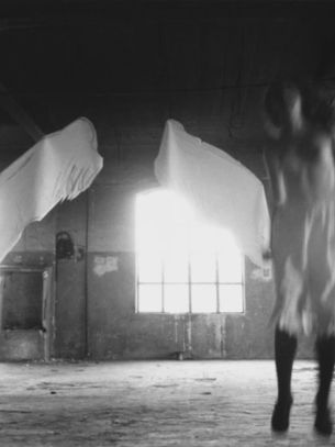
We looked for images to help us communicate this concept and ended up with a concept board composed of six images: ‘On being an angel’ (approx 1980) a photography by Francesca Woodman (8) that communicates dark emotions or a dark state of mind (as most of her work does) and the light that adds a feeling of fantasy; Benesse House (1988) (9)
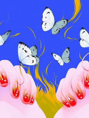
By the architect Tadao Ando who plays with heavy materials, shade and light symbolizing for us the space of mortuary; the image ‘Bubble’ (1963) (10) by Melvin Sokolsky, as a symbol of the veil of fantasy as if living inside an illusion. The colorful illustrations by the artist Sill.da (2022) (11) who’s into showing horror and uncanny scenes, through a colorful and whimsical lense. Finally the photography ‘Home is Where the Garden Grows’ (2020) (12), a series done by the photographer Erinn Springer — while grieving the death of his brother in law—, which we think captures the essence of magical thinking, of seeing the world through your inner child’s eyes as a survival mechanism to face the rawness of death.
DEVELOP, from unconscious to conscious
Expressive guide
With a clear concept it was time to get dirty and bring our concept to life. We translated our concept into expressive attributes. Tone: enchanted, unsettling, sensual, dynamic. Genre: dark fantasy, whimsical, mystery. Style: expressionist and sublime.
Time & Place: a place inspired by Tadao Ando’s (13) architecture style “emphasis onemptiness of the space”, unknown time.

After defining these attributes we needed visuals to answer the question of ‘How are we going to communicate this concept?’ The immediate image that came to mind was a juxtaposition of a colorful fantasy —Bambi, the magical thinking — and a gray, sharp-edged space —mortuary, a cold place where you face the reality of death—. These two components are blended by the vail of magical thinking, which would be represented in the images through the lightning decisions.
We searched for textures that could convey this sensation and wound up in a mix a of gray marble (14) and adobe plaster (15) to give a cold and sharp environment, then we looked for inspiration in artists:
1. Adeolu Osibodu (16) a Nigerian photographer who captures an element of fantasy through a game of lighting and visual effects. 2. Anna- Maghradze (17) opened our minds on how we could play with an uncanny theme while using nature and flowers, through her images which carry a whimsical yet horror aspect to them (18) . 3. Christoffer Relander (19) posed the matter of double exposure and background layering. 4. Diego Moreno reminded (20) us of the importance of the uncanny and the dynamic aspects that it can bring into an image. (21)
5. Florian Imgrund (22) again with the double exposures, the mysterious air of black and white and an invitation to communicate through light. 6. Intimacy photographer Lina Scheynius (23) connected us to the language of flowers through photography with the black calla and we revisited the artists that inspired us since day one: Erinn Springer (24) and Francesca Woodman. (25)
We did an initial scouting of the space, provided by FlowersbyBornay, where we pre-selected some corners inside Bornay that had a similar feel to our references: the back office shed and a large window (26) were our initial options. They served as a starting point material-wise while we defined a set that could give us the aspect of mystery, as well as unveiling/discovering something. This made us look for references of light when used as an active subject in photography (27) or when it is used to represent magic. (28)
Then it was time to focus on the main material: flowers. We wanted flowers to represent Bambi, to represent a dark fantasy where you randomly found magic in the middle of the forest (29) , to embody color and contrast. (30)
Lastly, as a vessel for the enchanted Bambi, we wanted to create an organic fantasy forest, that would serve as a passage between the darkness of the mortuary and the colorfulness of Bambi, we were inspired by rocks (31) , dried stems (32) and green moss setups (33) . Thus, we joined what we had gathered from the space scouting, our flower inspiration, and lighting options, and decided on an initial proposal.
For Bambi a combination of different magic-seemly flowers (34) , for the vessel a mix of death and alive vegetation (35) , which led us to a couple of sketches for the installation (36) . And for the lightning ideas, we tried out digital options which served as a guide for the photo process (37) . We were set to get materials, equipment and to jump into production.
DIRECT, think and expand
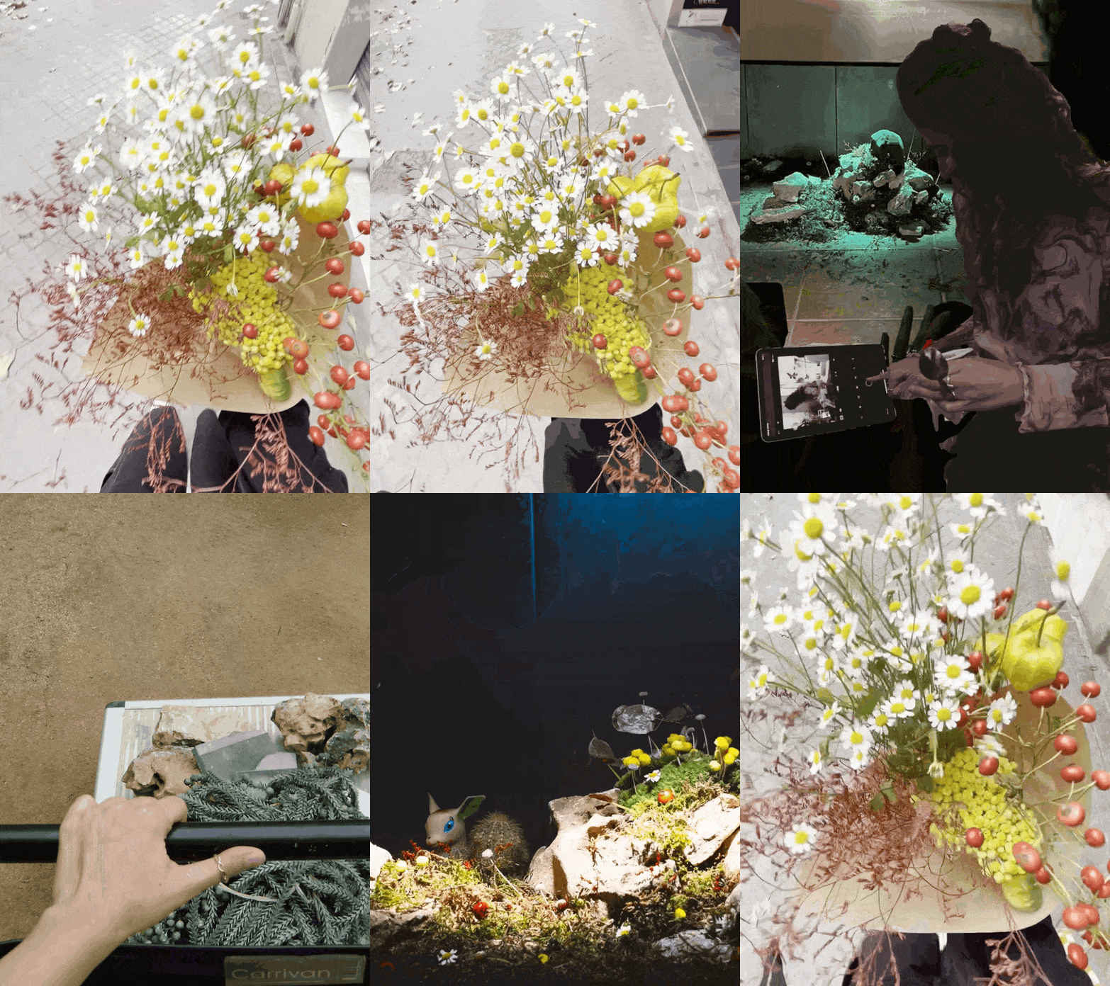
For the location we settled on a concrete and brick tub (38) which gave us a perfect opportunity to control light. For the installation we began with “the vessel” which represented a fantasy place inside a forest, using a mix of rocks (39) , floral foam, moss, grass and pops of color with tiny daisies, winter berries, yellow craspedia and tiny grayish pumps. As we built the set we checked the installation color through the lightning. (40)
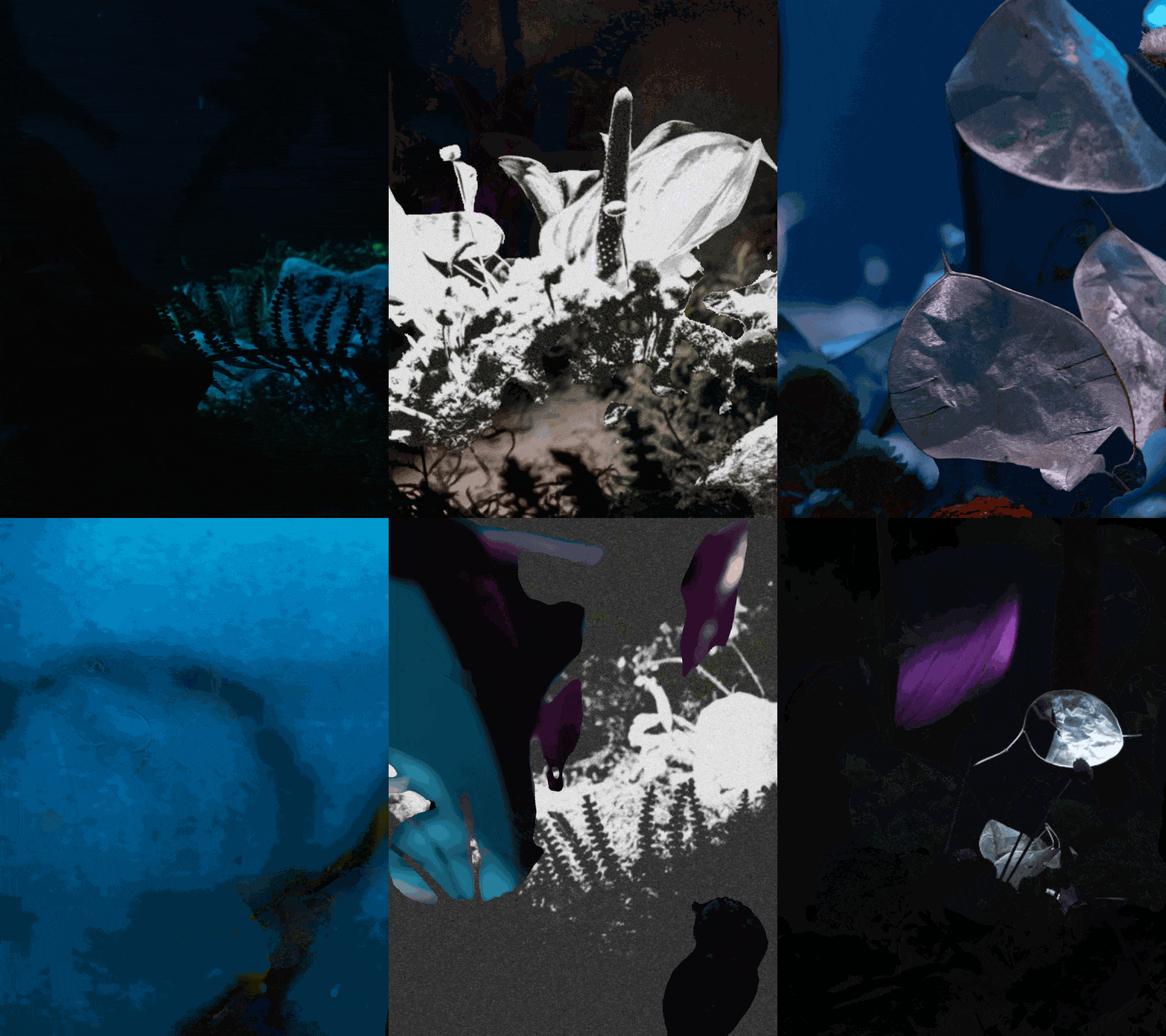
At first, we experimented with a spotlight, playing around with blue filters to evoke a mortuary atmosphere. (41)
Simultaneously, we used a light panel to illuminate our Bambi element.
After careful consideration and encountering challenges with the light panel's intensity (directing it precisely where needed proved tricky) (42), we decided for flashes.
Our representation of Bambi—the embodiment of magical thinking—features a purple anthurium surrounded by translucent lunar plants, with a couple of purple water lilies (43) . We arrived at that composition after numerous trial-and-error attempts (44) , following our hunches. Many different alternatives were explored, as the flowers we had initially thought would work didn’t harmonize as well as expected. We also experimented with various options for the foreground, such as silhouettes, branches, and cut cardboard to frame the shot. (45)
The finish touch: Bambi (46) . Throughout the design process, we aimed to avoid a direct representation of Bambi, but while directing we stumbled upon a vintage toy store and found it. The toy felt whimsical and uncanny simultaneously, serving as the missing piece to tie up our expressive guide. It reconnected us with Sii.da’s artwork, Diego Moreno’s uncanny and disturbing photographs, and added dynamism to the piece.
After much tweaking, testing, moving around, laughing and stressing, we got our shot.

FINAL PIECE
WHO IS IT FOR?
After thinking of different people, companies and brands, we decided that we would love to gift our installation to Alain de Botton, The School of Life’s founder, as an invitation to further explore Bambi Mortuary as a creative concept and as an aesthetic strategy. The School of Life, as its founder, is the living representation of a modern approach to complex philosophical topics, such as death. This project could function as a basis to create an animated series around grief for their Youtube channel or even maybe inspire a book.
So, Alain de Botton, if you are reading this, please, reach out ;)
TEAM
Alejandra Diaz
Joshua Glunz
Dina Stescovich
Susie Shakeri

Gracias
bottom of page


